Redesigning a queue management system
Project type
SaaS
Client
XA Technologies
Role
UX/UI Designer & Researcher
Timeframe
5 months

Infini-Q is a customizable SaaS queue management system developed by XA Technologies and used by organisations such as WEB Aruba. While the platform handled ticketing, it lacked the tools needed to support daily operations. Poor system feedback, limited visibility, and inefficient workflows led to agent errors, reduced supervisor oversight, and frequent service selection mistakes by clients. My goal was to redesign the experience across the entire platform, improving usability without disrupting the workflows users already relied on.



Research
Through user interviews, observations, and workflow analysis, I found that the system consistently failed to communicate with its users. Important actions lacked feedback, issues remained invisible until they became problems, and different user groups had fundamentally different information needs. One of the most valuable insights came from what users didn't say. Many frustrations had become so ingrained in their daily work that they were accepted as normal. Only when alternative solutions were introduced did these hidden pain points surface.
Service agents needed proactive feedback to prevent small workflow errors from accumulating throughout the day. Supervisors needed real-time visibility into service floor activity instead of relying on retrospective reporting. Clients needed clearer guidance at the kiosk to reduce incorrect service selections before entering the queue.

Process
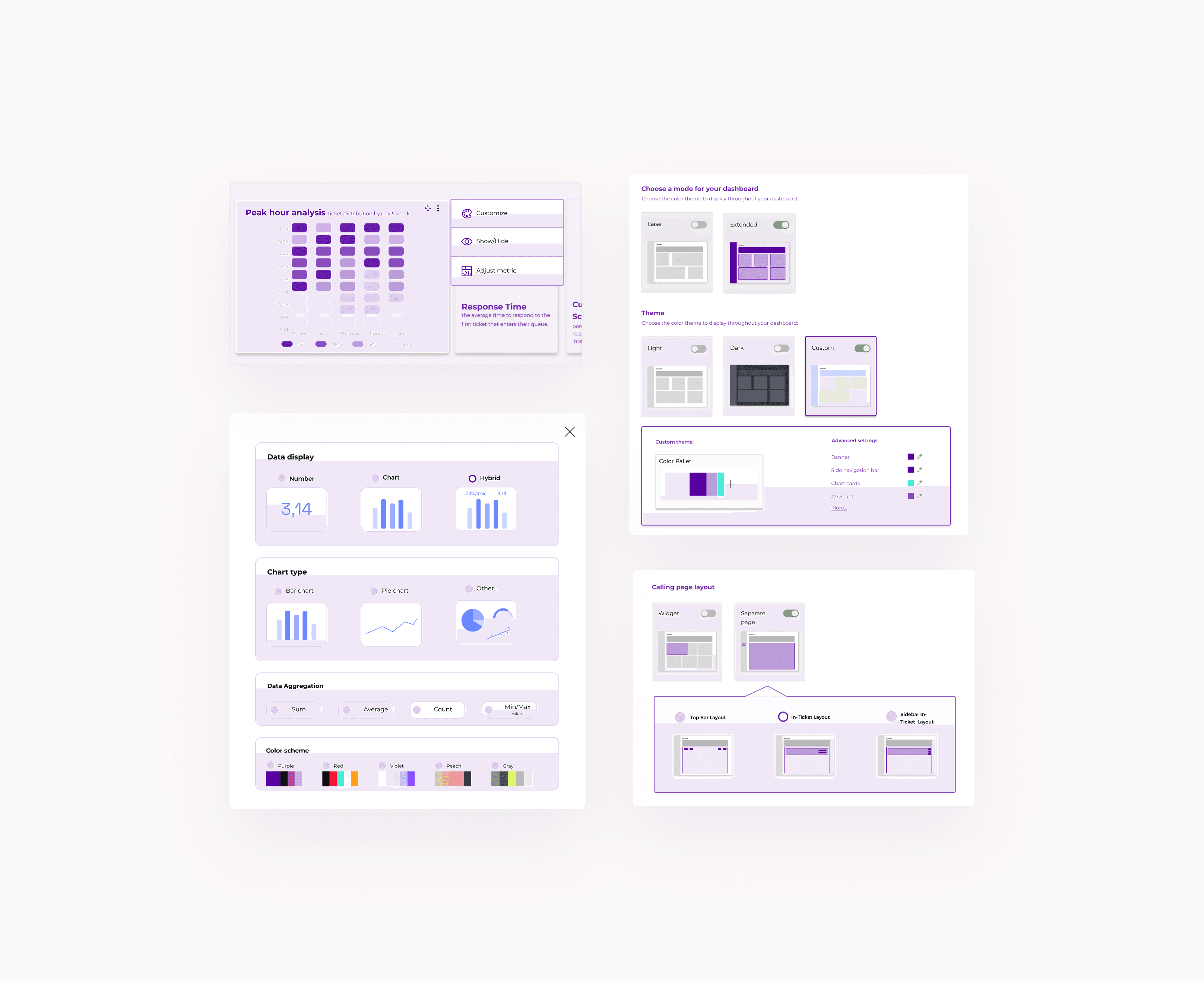
A central question shaped the project: How do you improve a system when users don't want it to change? Rather than replacing familiar workflows, I focused on strengthening them. The redesign preserved existing mental models while introducing clearer feedback, proactive guidance, role-specific experiences, and greater flexibility where it added value. This approach influenced every part of the product, from configurable dashboards and contextual ticket transfers to real-time notifications, performance tracking, and a redesigned self-service kiosk.
Final product and Reflection
The original system made ticket handoffs difficult by providing no way to pass context between agents. The redesign streamlines transfers with notes, common transfer reasons dropdown, and a shared customer history view, helping agents pick up conversations without losing information. Agents often relied on colleagues or scattered resources to find answers. The new knowledge base centralises internal documentation into a searchable, categorised resource that can be accessed directly within the workflow. Research showed that clear goals and recognition can drive accountability more effectively than reporting alone. The new system gives agents visible targets, tracks progress, and rewards achievements. Clients often selected the wrong service due to unclear and overly generic options. The kiosk was redesigned to make service selection clearer and more intuitive. Card-based options combine text and visual cues, a step indicator provides guidance through the ¡process, and accessibility features support a wider range of users. Service options were also adjusted to reduce incorrect selections. Designing for resistant users is one of the more interesting UX challenges you can face. The designer instinct is to win people over with better features. However I've found that sometimes it's better to meet users where they are and give them a path toward more, on' their terms. This was a five-month graduation project completed at XA Technologies. The full prototype covers every system touchpoint.