Menu navigation redesign

Project type

Navigation - IA

Client

Pink Gellac

Role

Solo UX/UI designer

Timeframe

1 month

As Pink Gellac expanded into new product categories, the existing mega-menu had reached the limit of what it could carry. I redesigned the navigation from the ground up — introducing a layered structure that reduces decision fatigue, introduces the product range gradually, and scales easily allowing more categories to be added.

The original mega-menu expanded every category, subcategory, and product type visible in a single open panel. Everything was equally visible, equally weighted, and equally demanding of a decision our users may have not been prepared to make. As new product lines were introduced, the problem wasn't going to solve itself. Navigation problems are rarely just navigation problems. The existing menu wasn't necessarily broken, it just outgrew it's purpose, so I took the current state and mapped how the category structure had evolved alongside the product range, identified where it was creating friction, and looked at available data.

Rather than treating the menu as a list of links, I wanted to understand what people expected to find before they even interacted with it. Looking at mental models and information architecture helped explain where those expectations started to diverge. Hick's Law became a useful lens throughout, reinforcing the idea that every additional choice adds friction when users are still trying to orient themselves. At the same time, conversations with the marketing and e-commerce teams shifted the challenge beyond navigation. The menu also had to introduce the product range to first-time visitors, helping them build an understanding of the catalogue instead of expecting them to already have one.

Desktop

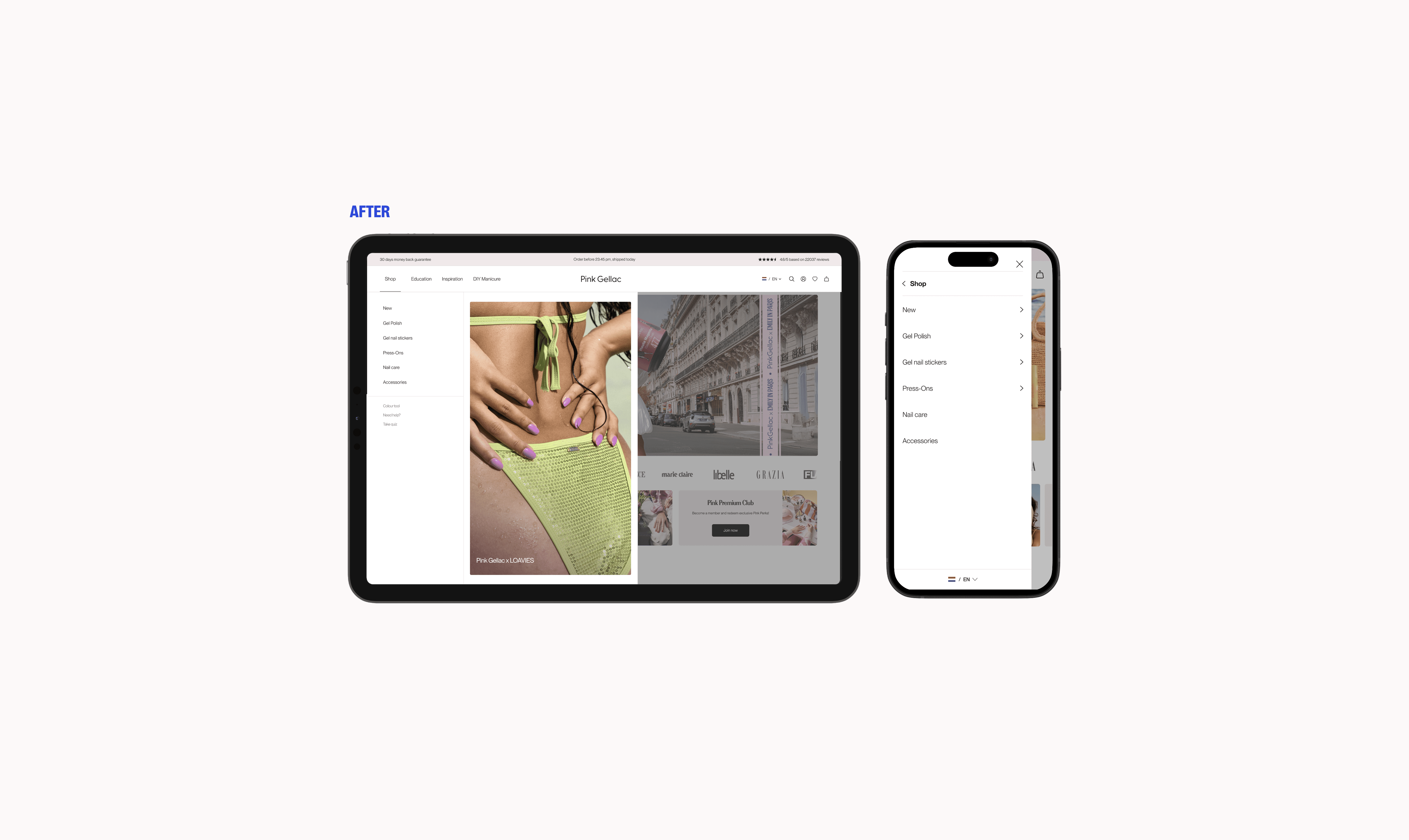
The new desktop navigation operates across three layers — six top-level categories, subcategories revealed on hover, and a maximum of two sub-levels beyond that. Each layer asks for one decision before the next opens, which mirrors how people naturally narrow down a browsing choice. The three-level cap keeps the structure from growing unwieldy as the range continues to expand, new categories slot in without requiring a structural rethink. Alongside the permanent product categories the tab structure accommodates additional entries the team can add seasonally e.g, a sale tab, a new collection spotlight, a limited-run category. This was done with the intention of designing the menu as a system, one the commercial team could operate independently after handoff. Colour plays an active role in the navigation. The promotional tab is visually differentiated from the rest with a distinct colour from the brand guide that signals its commercial nature immediately.

Desktop

The new desktop navigation operates across three layers — six top-level categories, subcategories revealed on hover, and a maximum of two sub-levels beyond that. Each layer asks for one decision before the next opens, which mirrors how people naturally narrow down a browsing choice. The three-level cap keeps the structure from growing unwieldy as the range continues to expand, new categories slot in without requiring a structural rethink. Alongside the permanent product categories the tab structure accommodates additional entries the team can add seasonally e.g, a sale tab, a new collection spotlight, a limited-run category. This was done with the intention of designing the menu as a system, one the commercial team could operate independently after handoff. Colour plays an active role in the navigation. The promotional tab is visually differentiated from the rest with a distinct colour from the brand guide that signals its commercial nature immediately.

Desktop

The new desktop navigation operates across three layers — six top-level categories, subcategories revealed on hover, and a maximum of two sub-levels beyond that. Each layer asks for one decision before the next opens, which mirrors how people naturally narrow down a browsing choice. The three-level cap keeps the structure from growing unwieldy as the range continues to expand, new categories slot in without requiring a structural rethink. Alongside the permanent product categories the tab structure accommodates additional entries the team can add seasonally e.g, a sale tab, a new collection spotlight, a limited-run category. This was done with the intention of designing the menu as a system, one the commercial team could operate independently after handoff. Colour plays an active role in the navigation. The promotional tab is visually differentiated from the rest with a distinct colour from the brand guide that signals its commercial nature immediately.

Mobile

Mobile navigation for a product range of this size presented a fundamentally different challenge than desktop. I explored several navigation flows with a strong focus on clarity, orientation, and reducing friction, ensuring users could find what they needed without feeling lost, confused, or overwhelmed. Research identified subcategory-first navigation as best practice, though most e-commerce sites still fail to utilize it. Because educating customers around the product range was one of our key goals, I explored using subtitles and contextual imagery to support category labels and help first-time visitors navigate more intuitively. Some iterations improved discoverability, but were ultimately dropped back to avoid overwhelming the interface. The final direction keeps the navigation readable as layers get more granular, titled layers with clear typographic hierarchy, and a structure that stays coherent even at the third level where subcategories like individual product types appear.

Mobile

Mobile navigation for a product range of this size presented a fundamentally different challenge than desktop. I explored several navigation flows with a strong focus on clarity, orientation, and reducing friction, ensuring users could find what they needed without feeling lost, confused, or overwhelmed. Research identified subcategory-first navigation as best practice, though most e-commerce sites still fail to utilize it. Because educating customers around the product range was one of our key goals, I explored using subtitles and contextual imagery to support category labels and help first-time visitors navigate more intuitively. Some iterations improved discoverability, but were ultimately dropped back to avoid overwhelming the interface. The final direction keeps the navigation readable as layers get more granular, titled layers with clear typographic hierarchy, and a structure that stays coherent even at the third level where subcategories like individual product types appear.

Mobile

Mobile navigation for a product range of this size presented a fundamentally different challenge than desktop. I explored several navigation flows with a strong focus on clarity, orientation, and reducing friction, ensuring users could find what they needed without feeling lost, confused, or overwhelmed. Research identified subcategory-first navigation as best practice, though most e-commerce sites still fail to utilize it. Because educating customers around the product range was one of our key goals, I explored using subtitles and contextual imagery to support category labels and help first-time visitors navigate more intuitively. Some iterations improved discoverability, but were ultimately dropped back to avoid overwhelming the interface. The final direction keeps the navigation readable as layers get more granular, titled layers with clear typographic hierarchy, and a structure that stays coherent even at the third level where subcategories like individual product types appear.

Campaign display

A dedicated slot for promotional content within the menu The design includes a reserved space for marketing imagery or campaign banners within the menu panel giving the commercial team a placement that sits at the point of product browsing without disrupting the navigation structure. This was prioritised for a second release but wasn't implemented due to internal restructuring of the team and workforce.

Campaign display

A dedicated slot for promotional content within the menu The design includes a reserved space for marketing imagery or campaign banners within the menu panel giving the commercial team a placement that sits at the point of product browsing without disrupting the navigation structure. This was prioritised for a second release but wasn't implemented due to internal restructuring of the team and workforce.

Campaign display

A dedicated slot for promotional content within the menu The design includes a reserved space for marketing imagery or campaign banners within the menu panel giving the commercial team a placement that sits at the point of product browsing without disrupting the navigation structure. This was prioritised for a second release but wasn't implemented due to internal restructuring of the team and workforce.

Field states and Micro interactions

Navigation design is often defined by the interaction details users barely notice when they work well. Internally there were few discussions on topics such as states, interaction feedback, hover vs. click interactions. For the navigation went with 'on hover' for speed and fluidity, while specifically designing broader hover zones so users didn’t have to navigate the menu with excessive precision, a common (and personal) source of frustration in layered navigation systems. Active categories were reinforced through brand colour and directional arrow cues. Every interaction state was designed to either provide orientation or reduce uncertainty.

Field states and Micro interactions

Navigation design is often defined by the interaction details users barely notice when they work well. Internally there were few discussions on topics such as states, interaction feedback, hover vs. click interactions. For the navigation went with 'on hover' for speed and fluidity, while specifically designing broader hover zones so users didn’t have to navigate the menu with excessive precision, a common (and personal) source of frustration in layered navigation systems. Active categories were reinforced through brand colour and directional arrow cues. Every interaction state was designed to either provide orientation or reduce uncertainty.

Field states and Micro interactions

Navigation design is often defined by the interaction details users barely notice when they work well. Internally there were few discussions on topics such as states, interaction feedback, hover vs. click interactions. For the navigation went with 'on hover' for speed and fluidity, while specifically designing broader hover zones so users didn’t have to navigate the menu with excessive precision, a common (and personal) source of frustration in layered navigation systems. Active categories were reinforced through brand colour and directional arrow cues. Every interaction state was designed to either provide orientation or reduce uncertainty.

Reflection

The redesigned navigation is live across desktop and mobile, has accommodated new product additions since launch without structural changes, and gave the commercial team a seasonal tab system and campaign placement they can operate without raising a design or dev ticket.