Menu navigation redesign
Project type
Navigation - IA
Client
Pink Gellac
Role
Solo UX/UI designer
Timeframe
1 month

Redesigning Pink Gellac’s menu navigation to support the growing product range
When I started working on the navigation, the main challenge was not that the existing menu was poorly designed. It had worked well for the stage the company was in at the time. The problem was that the product range had grown significantly since then.
As new categories, collections, and product types were introduced, the mega-menu started becoming harder to use. Everything was being shown at once, every category, every subcategory, every product type. While this gave customers access to the entire range, it also meant they had to understand the structure of the catalogue before they could navigate it. The menu had become more of a product overview than a tool for helping people find what they needed. My goal was to rethink the navigation structure and come up with a solution that could support both sides of the business.

Understanding the problem
The first step was understanding the relationship between categories. Which products belonged together? Where were customers likely to expect certain products to be? And where did our internal product structure differ from how customers naturally think about shopping?
This was especially important because Pink Gellac has customers with different levels of experience. Some visitors arrive knowing exactly what they want, while others are discovering the brand for the first time and need guidance. The navigation needed to support both behaviours. A returning customer should be able to quickly reach a familiar product category, while a new customer should be able to understand the range without having to learn the entire catalogue structure first. This was where the existing mega-menu struggled. It gave users all the information, but not necessarily in the order they needed it.
The details that make navigation feel easy
Desktop
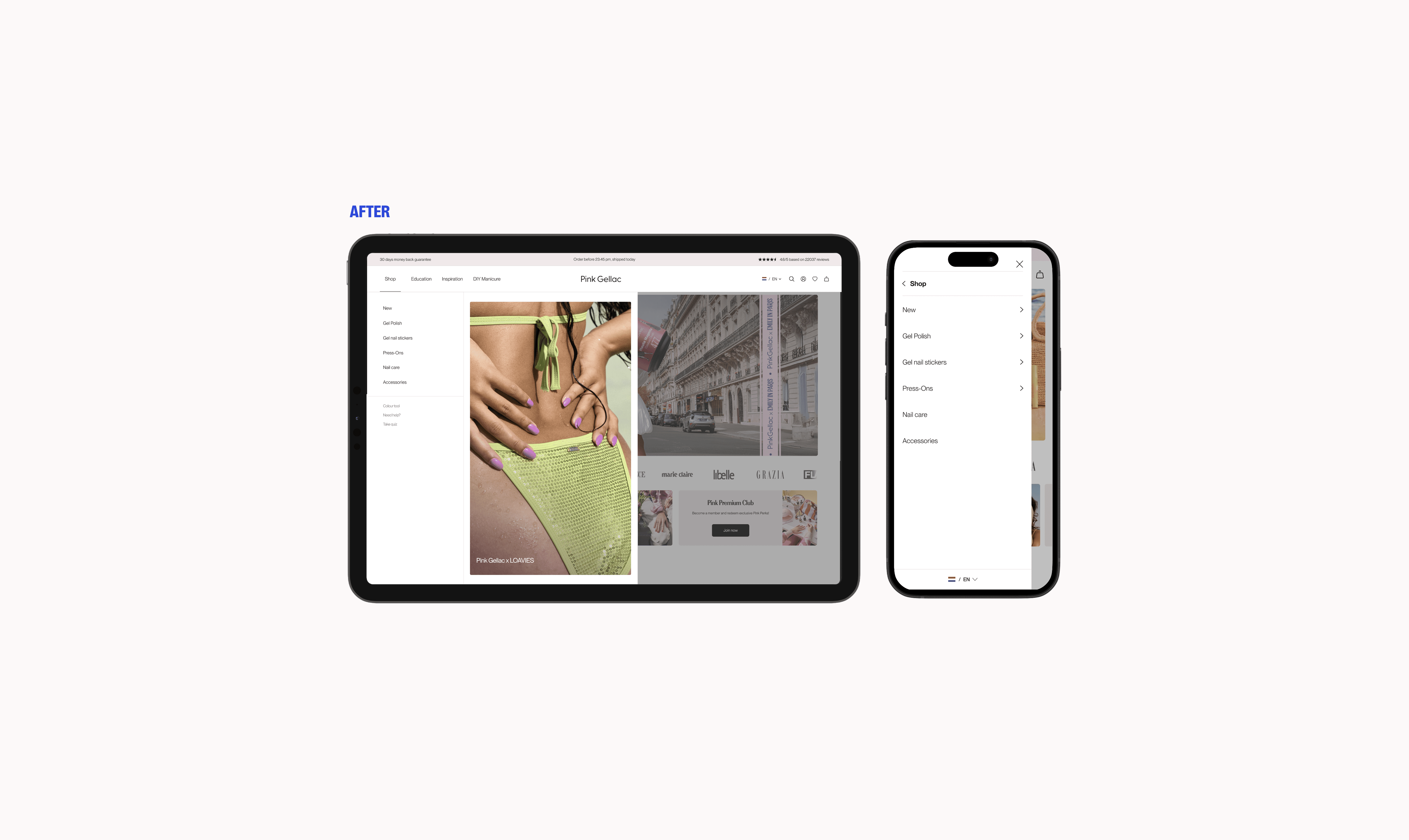
The new desktop navigation operates across three layers - six top-level categories, subcategories revealed on hover, and a maximum of two sub-levels beyond that. Each layer asks for one decision before the next opens, which mirrors how people naturally narrow down a browsing choice. The three level linit keeps the structure from growing unwieldy as the range continues to expand, new categories slot in without requiring a structural rethink.
Mobile
Mobile navigation for a product range of this size presented a fundamentally different challenge than desktop. I explored several navigation flows with a strong focus on clarity, orientation, and reducing friction, ensuring users could find what they needed without feeling lost, confused, or overwhelmed. Research identified subcategory-first navigation as best practice, though most e-commerce sites still fail to utilize it. Because educating customers around the product range was one of our key goals, I explored using subtitles and contextual imagery to support category labels and help first-time visitors navigate more intuitively. Some iterations improved discoverability, but were ultimately dropped back to avoid overwhelming the interface.
The final direction keeps the navigation readable as layers get more granular, titled layers with clear typographic hierarchy, and a structure that stays coherent even at the third level where subcategories like individual product types appear.


With Commercial in mind
A thing that became clear during the process was that navigation is also an important commercial tool.
The marketing team often needs to highlight new launches, collections, or promotional moments. The previous structure did not provide much flexibility for these needs.
As part of the redesign, I created space within the navigation system for such temporary additions. This allowed the team to introduce campaign-driven items without changing the underlying structure.
For example, promotional sections such as sales or new collections could exist alongside the permanent product categories while still feeling like part of the same experience. The intention was not to make promotions louder, but to make their role clearer.
Field states and Micro interactions
A lot of navigation design comes down to small interaction decisions that users should never have to think about. One example was deciding how desktop navigation should open. We chose a hover interaction because it allowed customers to browse categories quickly without adding unnecessary clicks.
However, hover menus often become frustrating when they require too much precision. A small cursor movement can accidentally close the menu, forcing users to start over. (this may also be a personal grudge)
To avoid this, I designed larger interaction areas and more forgiving hover behaviour. The menu should respond naturally to exploration rather than requiring users to carefully control every movement. Active states, arrows, and colour changes were also introduced to improve orientation. These details help answer simple but important questions: Where am I?, What can I select?, What happens next?

Reflection
The redesigned navigation gave Pink Gellac a stronger foundation for a growing product catalogue.
Since launch, the structure has been able to accommodate new products without requiring major changes. The commercial team has more flexibility to introduce promotional content, while customers have a clearer way to explore the range.