Redesigning a queue management system
Project type
SaaS
Client
XA Technologies
Role
UX/UI Designer & Researcher
Timeframe
5 months

From Queue Management tool to operational intelligence platform
Infini-Q is a customizable SaaS queue management system developed by XA Technologies and used by organisations such as WEB Aruba. The platform is used by service agents and supervisors to manage customer interactions, tickets, and daily operations.
The existing product was effective at supporting basic service workflows, but it had reached the limits of its original purpose. Agents could process tickets efficiently, yet the system provided little visibility into performance, operational trends, or the impact of their work. Supervisors relied heavily on manual reporting and lacked the real-time information needed to manage service quality effectively.
The challenge was balancing two competing needs: maintaining the simplicity that made the existing system approachable while introducing the intelligence and flexibility required by a growing service operation.
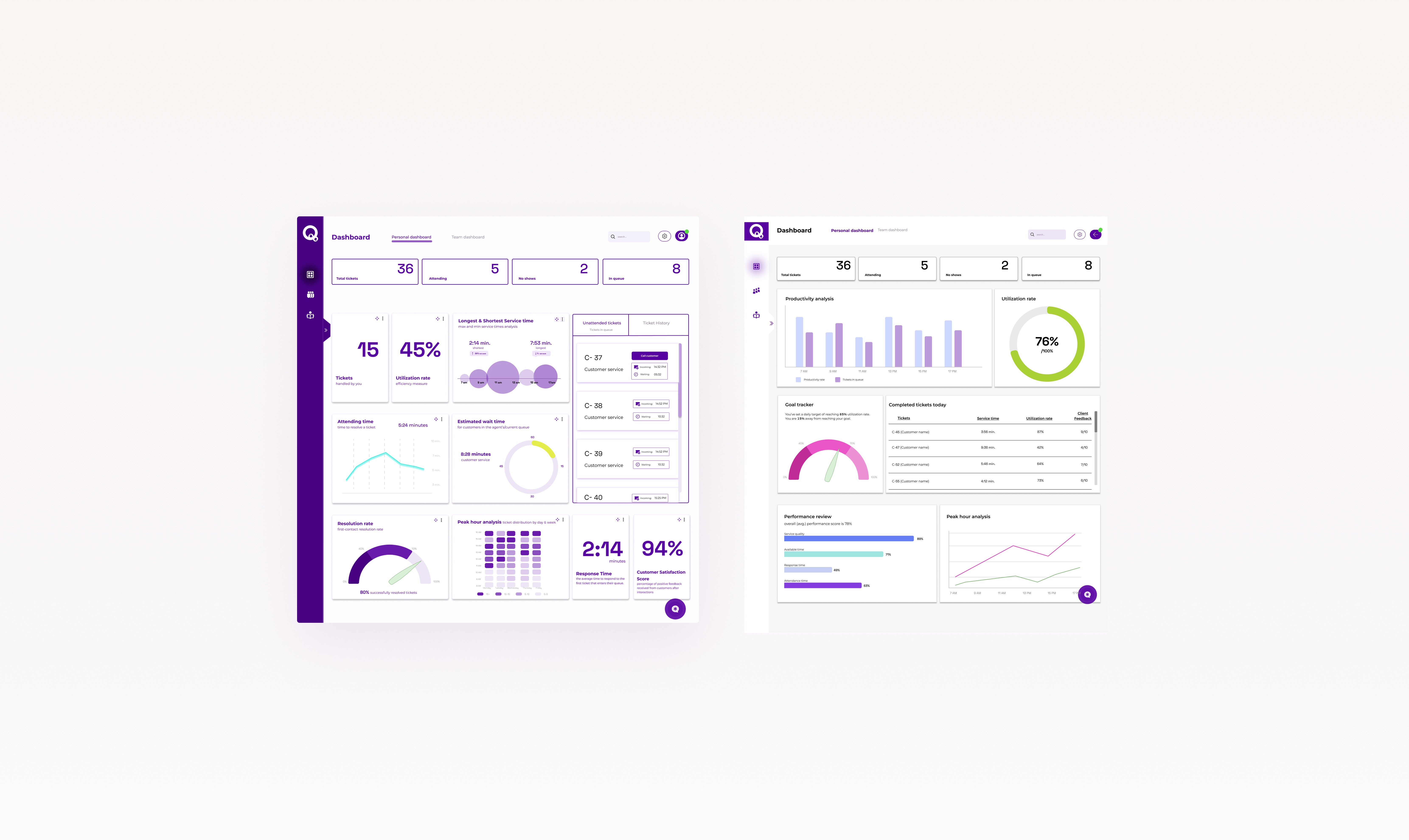
The result was a redesigned experience centred around personalised dashboards, improved workflows, and data-driven tools that support both individual agents and operational leaders.
The Challenge:
Introducing more value without increasing complexity
Service agents understood the existing system, trusted it, and could complete their daily tasks without friction. However, familiarity had also created a limitation. Users had adapted to what the system allowed rather than what they actually needed.
During research, agents consistently described the system as easy to use. But when discussing previous software experiences or competitors, they immediately identified missing functionalities or areas for improvement. Which shifted my direction of work towards evolving the platform into one that users relied on by introducing functionalities that supported better awareness and decision-making. Rather than adding more information to the interface, I focused on creating a system where users could access the right information at the right level of complexity.

Flexible dashboard architecture
A single dashboard experience could not effectively serve every user type. Service agents needed speed and clarity during customer interactions. Supervisors needed operational visibility and performance insights. More experienced users wanted deeper control over how information was displayed.
To address these different needs, I introduced two dashboard modes: Base and Extended. Base Mode maintained the familiarity of the existing experience while improving structure, hierarchy, and usability. It provided essential operational information without introducing unnecessary complexity. Extended Mode was designed for users who needed more control. It introduced customizable widgets, filtering, additional metrics, and advanced visualization options.
The decision was intentional, because I've found that true adoption comes from a confident user, and in that case this meant giving users control over when and how complexity is introduced. This way the dashboard supports different levels of experience without forcing every user into the same workflow.
Performance data ownership
A major opportunity identified during research was the relationship between employees and performance data. Previously, metrics were primarily available to supervisors. Agents were expected to improve their performance without always having visibility into the measurements being used to evaluate them.
It became a feedback mechanism for employees. The redesigned agent dashboard introduced visibility into individual performance, team comparisons, and operational outcomes. The purpose was not to create pressure through measurement, but to create awareness and accountability.

Extending the Dashboard Into an Operational Workspace
The dashboard became the foundation of the redesigned experience, but research showed that improving service operations required more than presenting information effectively. Agents needed the system to support throughout workflow.
Performance data ownership
One of the biggest risks in dashboard design is assuming that more information leads to better decisions. A key focus was balancing access to performance-critical data with avoiding cognitive overload that could disrupt daily workflows.
The dashboard was structured around modular data cards, creating clearer hierarchy and helping users focus on the information most relevant to their role. Since users interpreted information differently, with some preferring numerical metrics and others visual trends, configurable visualization settings were introduced at both dashboard and card level, allowing users to personalize how data was presented based on their workflow and decision-making needs.
Knowledge sharing
Research revealed that agents frequently relied on experienced colleagues for process-related questions because there wasn't a unified point of knowledge after their onboarding.
For this reason I built a centralised knowledge base within the platform, providing a single source of truth for processes, guidelines, and common solutions. The concept was highly valued by supervisors, who saw it as an opportunity to reduce dependency on individual expertise, shorten case resolution times, and help agents handle requests more confidently and consistently.

Maintaining context during ticket transfers
One recurring simple, yet essential workflow issue was the loss of context when transferring tickets between teams. Agents could move a ticket to another queue, but they had no way to communicate important details with the receiving team.
To solve this, I introduced transfer notes and predefined transfer reasons, ensuring critical customer context remained attached to the ticket and reducing unnecessary back-and-forth between teams.


Agent Assistant
Many operational errors occurred because the system provided limited guidance during critical moments in the workflow. Agents could miss important actions such as updating statuses, completing transfers, or following required steps, impacting both workflow accuracy and performance reporting.
This led to the introduction of an assistant widget that provided proactive support through notifications, reminders, quick actions, and contextual guidance. Rather than relying on users to remember every step, the assistant surfaced relevant actions at the right moment, reducing cognitive effort and helping agents maintain more consistent workflows.
Kiosk check-in
One of my first findings when I started working on this project was that the many of the issues comes from first touchpoint of the whole experience - the kiosk. More than half of the customers were selecting the wrong service, thus creating unnecessary transfers and avoidable delays later on.
To make service choices easier to understand I decided to use a combination between text and icons, along with short descriptions to improve recognition, because many of the clients were older people or people struggling with language barrier. Accessibility was further enhanced through text-to-speech support, making the experience more inclusive.

Supervison expeirence
Supervisors had different needs from service agents, requiring both immediate operational awareness and deeper performance analysis. From my interview with the supervisor I found out that currently the system lacked real-time visibility into service activity while also relying on manual reporting for performance insights.
To support these different decision-making moments, the supervisor experience was divided into two dashboard views: Live and KPI. The Live dashboard focused on real-time queue activity and operational issues, while the KPI dashboard provided performance trends, metrics, and customisable reporting.
