Interactive colour matching tool
Project type
Tool UI - User flow
Client
Pink Gellac
Role
Solo UX/UI Designer
Timeframe
2 months
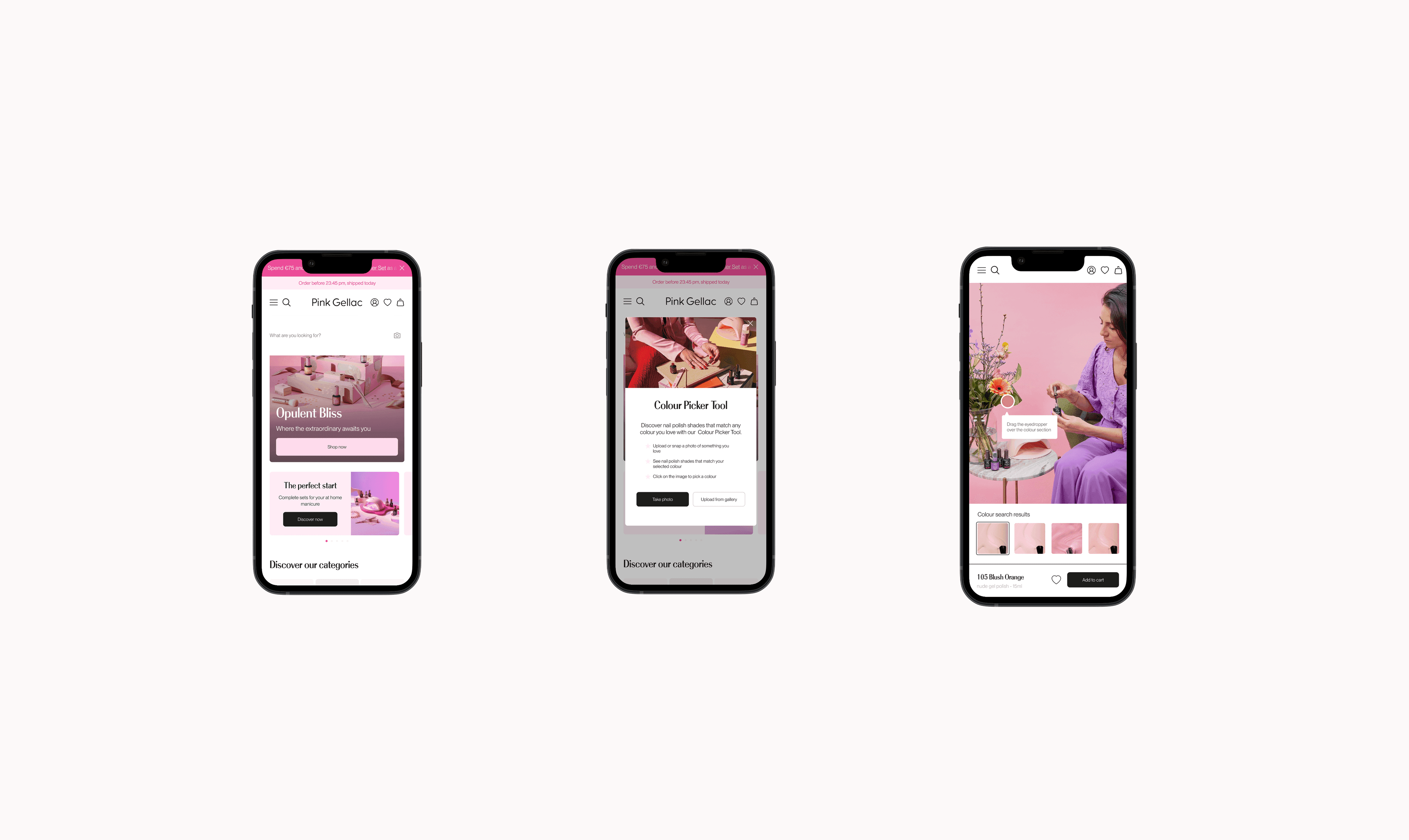
Designing a colour matching experience for Pink Gellac’s E-commerce platform
Finding the right colour online is quite difficult. Many customers discover nail shades through social media, inspiration images, or seeing a colour worn by someone else. The challenge begins when they try to recreate that look and find the closest match within a catalogue of hundreds of products.
When I joined the project, the logic and core functionality were already in place. My role was focused on the interaction design, information architecture, interface, and customer journey that completed the tool into an actual usable tool.

Challanges & Process
Colour matching is inherently imprecise. Lighting conditions, screen calibration, and subjective perception all affect results. The main challenge was therefore not technical accuracy, but user confidence, designing an experience that felt reliable enough for purchase decisions without overpromising precision.
Initial explorations tested broader directions such as generating colour palettes or suggesting complementary shades alongside matches. While visually engaging, these approaches introduced unnecessary complexity and moved away from the core user need: quickly identifying purchasable products.
The direction was narrowed back to a focused matching experience that prioritised clarity, speed, and commercial intent.


Designing the experience around the customer journey
The main challenge was not only making the colour matching tool usable, but ensuring it felt like a natural part of the shopping experience.
01/ Integrated into existing discovery behaviour
Data analysis showed that the search bar was one of the highest-traffic areas of the website, making it a key entry point for product discovery. However, search queries revealed that many customers were looking for broad colour terms such as "red", "pink" or "blue".
While this reflected clear purchase intent, these queries rarely helped customers find the specific shade they had in mind, as each colour category contained dozens of variations. As a result, customers were more likely to abandon their search, increasing the risk of drop-off before purchase and ultimately reducing conversion opportunities.
Therefore embedding the tool in the search area felt like the most right decision. Positioning the feature there made colour matching feel like an extension of an existing behaviour rather than another feature users had to discover.
02/ Setting clear expectations
Because colour matching can never be completely exact, I worked through several iterations with the Digital Manager to refine the wording and ensure the experience felt trustworthy without overpromising accuracy. From both a UX and commercial perspective, it was important to minimise confusion and avoid setting unrealistic expectations.
The interface uses terms such as "Closest match" and "Search results" to make it clear that recommendations are based on similarity, not exact replication or custom colour creation. Likewise, when no suitable match is found, no products are displayed. Instead, the empty state reinforces the purpose and limitations of the tool, helping users understand what the feature can and cannot do.
03/ Framed by the funnel
The experience is designed as a modal overlay, giving the colour matching tool its own focused moment while allowing users to remain within the shopping flow. Keeping the original inspiration image visible throughout the flow helped users continuously compare the recommended shades against their reference.
To reduce friction and maintain purchase momentum, I included 'Add to cart' and 'Add to wishlist' directly into the overlay, removing the need to exit the experience to continue shopping. User actions are confirmed both locally through in-overlay feedback (such as confirmation banners) and on the underlying page, where the cart and wishlist states updated simultaneously, providing reassurance that their actions had been successfully completed.

Reflection
This project reinforced an important part of product design, which is that sometimes the biggest improvements do not come from adding more functionality, but from doing the opposite and making an existing functionality easier to understand and trust.
The tool launched successfully and was well received internally for its usability and clarity. However, like many e-commerce features, its long-term impact depended not only on the quality of the experience but also on visibility and integration within the wider product ecosystem. A good feature still needs to be discovered.