Shopify AI

Project type

Design - Build

Client

Pink Gellac

Role

Designer - Developer

Timeframe

Days per content

Designing and building components and pages using Shopify AI turned from early experimentation into a complete new workflow, allowing me to turn Figma designs to directly to live storefront sections within days without developer dependency.

Most design work in an in-house environment involves a handoff point — design is signed off, then development takes it across the line. For this body of work, I was responsible for both. The workflow compressed the design-to-launch cycle significantly and meant that final adjustments could be made in the build environment itself, rather than going back through the design-to-dev cycle for small changes. The briefs were typically a campaign name, conversion goal, and a rough list of what was needed. The design thinking, the component architecture, and the build were all mine to define. Several of the components that shipped weren't part of the original brief at all but they came out of the ideation stage or even during the building and iterating phase, and were proposed as additions that would serve the campaign more effectively.

Process

Short briefing Briefs arrived in the format of a business need rather than a design spec. "We want to offer bundles for this campaign" or "we need to drive conversion for the winter sale" - the design interpretation was mine to figure out. Exploration & Research Before opening Figma, I spend time understanding the space — reviewing previous design decisions on the storefront, looking at what competitors are doing, and mapping the user flow for anything with meaningful interaction complexity. If the brief touches conversion goals or campaign strategy, I'll go to the relevant team directly to get that context. The visual work follows the thinking. Defining the basis Figma is where I would define the layout, spacing, interaction logic, responsiveness. Sometimes the design was fully resolved here, but many other times I moved to Shopify with already a strong direction and made final adjustments in the build environment. It is often that the live product differs, by further iteration, that the original design. Building & Al The primary build tool was Shopify's Al, usually starting from HTML and CSS exported from Figma and iterating from there. For components with more technical complexity, I used Claude, Windsurf (or other tools), which handled the requirements more reliably. Few times, I tested generating directly from a design image for faster concept

Bundle Builder / Windsurf & Shopify AI · 3–4 iterations, 2 days · Built from scratch

The project began with a clear business objective to increase conversion and drive sales for an ongoing promotion, but Beyond that, the brief was open ended. During an internal ideation phase, the concept of a bundle-building experience came up as a promising way to increase basket size while creating a more engaging customer journey. I took ownership of the idea, defining the experience from concept through to launch. The concept moved from idea to working prototype within a day, allowing us to validate the approach quickly and focus on refining the user experience. Over the following iterations, I explored different ways to communicate progression, locked states, and rewards while keeping the interface simple and intuitive. The final solution introduced a guided bundle builder where customers select three products before unlocking a fourth complimentary item. The 'Add to Cart' action remains unavailable until all required selections are completed, preventing incomplete submissions while providing clear progress feedback throughout the journey. Most of the design effort focused on making the interaction feel self-explanatory. Through several iterations, I refined the visual cues and feedback mechanisms to clearly communicate when actions were available, locked, or completed without adding unnecessary complexity.

Bundle Builder / Windsurf & Shopify AI · 3–4 iterations, 2 days · Built from scratch

The project began with a clear business objective to increase conversion and drive sales for an ongoing promotion, but Beyond that, the brief was open ended. During an internal ideation phase, the concept of a bundle-building experience came up as a promising way to increase basket size while creating a more engaging customer journey. I took ownership of the idea, defining the experience from concept through to launch. The concept moved from idea to working prototype within a day, allowing us to validate the approach quickly and focus on refining the user experience. Over the following iterations, I explored different ways to communicate progression, locked states, and rewards while keeping the interface simple and intuitive. The final solution introduced a guided bundle builder where customers select three products before unlocking a fourth complimentary item. The 'Add to Cart' action remains unavailable until all required selections are completed, preventing incomplete submissions while providing clear progress feedback throughout the journey. Most of the design effort focused on making the interaction feel self-explanatory. Through several iterations, I refined the visual cues and feedback mechanisms to clearly communicate when actions were available, locked, or completed without adding unnecessary complexity.

Bundle Builder / Windsurf & Shopify AI · 3–4 iterations, 2 days · Built from scratch

The project began with a clear business objective to increase conversion and drive sales for an ongoing promotion, but Beyond that, the brief was open ended. During an internal ideation phase, the concept of a bundle-building experience came up as a promising way to increase basket size while creating a more engaging customer journey. I took ownership of the idea, defining the experience from concept through to launch. The concept moved from idea to working prototype within a day, allowing us to validate the approach quickly and focus on refining the user experience. Over the following iterations, I explored different ways to communicate progression, locked states, and rewards while keeping the interface simple and intuitive. The final solution introduced a guided bundle builder where customers select three products before unlocking a fourth complimentary item. The 'Add to Cart' action remains unavailable until all required selections are completed, preventing incomplete submissions while providing clear progress feedback throughout the journey. Most of the design effort focused on making the interaction feel self-explanatory. Through several iterations, I refined the visual cues and feedback mechanisms to clearly communicate when actions were available, locked, or completed without adding unnecessary complexity.

Category discovery hero / Campaign UX Components · Reusable · Sales visibility and conversion

Similar to the bundle builder project, this initiative originated from a broad business objective rather than a defined feature request. At the time, seasonal promotions were becoming more curated and theme-driven, but the existing experience relied heavily on static hero banners and separate entry points, which limited how many offers could be surfaced without cluttering the page. I proposed a more flexible approach that could present multiple sale categories within a single hero section, giving users faster access to relevant promotions while maintaining a clean and focused layout. This introduced a new pattern for how campaign content could be structured on the storefront, moving away from single-message hero banners toward a more exploratory, multi-option experience. Alongside this, I also explored adapting Product detail page (PDP) background imagery to reflect the active campaign or sale. The intention was to subtly reinforce the campaign context throughout the shopping journey and create a stronger sense of occasion. This added a more dynamic and unexpected visual layer to the otherwise consistent product page experience, helping draw attention to ongoing promotions without interrupting the core shopping flow.

Category discovery hero / Campaign UX Components · Reusable · Sales visibility and conversion

Similar to the bundle builder project, this initiative originated from a broad business objective rather than a defined feature request. At the time, seasonal promotions were becoming more curated and theme-driven, but the existing experience relied heavily on static hero banners and separate entry points, which limited how many offers could be surfaced without cluttering the page. I proposed a more flexible approach that could present multiple sale categories within a single hero section, giving users faster access to relevant promotions while maintaining a clean and focused layout. This introduced a new pattern for how campaign content could be structured on the storefront, moving away from single-message hero banners toward a more exploratory, multi-option experience. Alongside this, I also explored adapting Product detail page (PDP) background imagery to reflect the active campaign or sale. The intention was to subtly reinforce the campaign context throughout the shopping journey and create a stronger sense of occasion. This added a more dynamic and unexpected visual layer to the otherwise consistent product page experience, helping draw attention to ongoing promotions without interrupting the core shopping flow.

Category discovery hero / Campaign UX Components · Reusable · Sales visibility and conversion

Similar to the bundle builder project, this initiative originated from a broad business objective rather than a defined feature request. At the time, seasonal promotions were becoming more curated and theme-driven, but the existing experience relied heavily on static hero banners and separate entry points, which limited how many offers could be surfaced without cluttering the page. I proposed a more flexible approach that could present multiple sale categories within a single hero section, giving users faster access to relevant promotions while maintaining a clean and focused layout. This introduced a new pattern for how campaign content could be structured on the storefront, moving away from single-message hero banners toward a more exploratory, multi-option experience. Alongside this, I also explored adapting Product detail page (PDP) background imagery to reflect the active campaign or sale. The intention was to subtly reinforce the campaign context throughout the shopping journey and create a stronger sense of occasion. This added a more dynamic and unexpected visual layer to the otherwise consistent product page experience, helping draw attention to ongoing promotions without interrupting the core shopping flow.

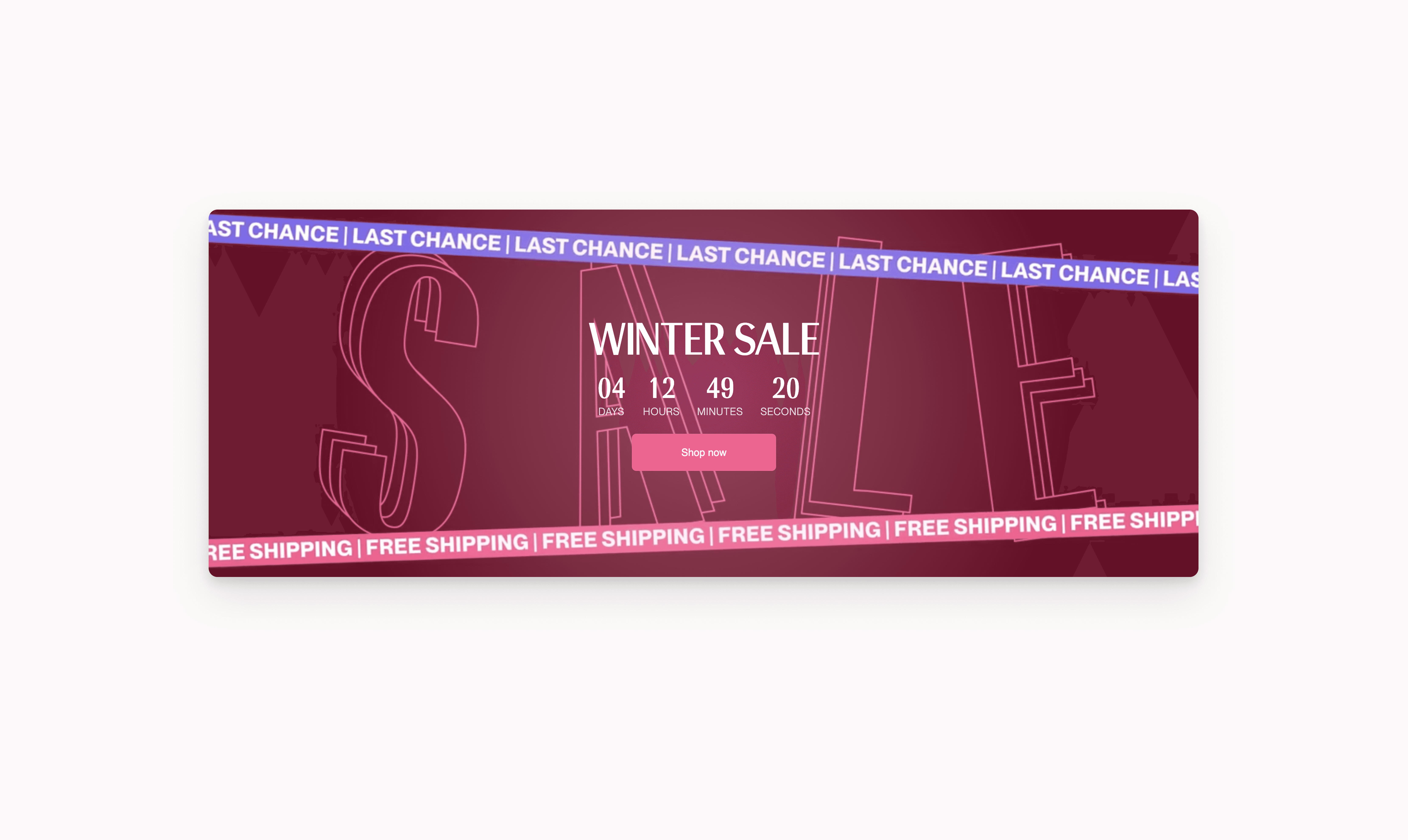
Countdown banner / Used across 2 campaigns · Reusable by design

Built within a day, based on request from the E-Comm team to push and bring awareness to running campaigns. Made to support both static image and video backgrounds, with a live countdown timer that communicated offer urgency at the point of browsing. It was used in both the winter and spring sale campaigns.

Countdown banner / Used across 2 campaigns · Reusable by design

Built within a day, based on request from the E-Comm team to push and bring awareness to running campaigns. Made to support both static image and video backgrounds, with a live countdown timer that communicated offer urgency at the point of browsing. It was used in both the winter and spring sale campaigns.

Countdown banner / Used across 2 campaigns · Reusable by design

Built within a day, based on request from the E-Comm team to push and bring awareness to running campaigns. Made to support both static image and video backgrounds, with a live countdown timer that communicated offer urgency at the point of browsing. It was used in both the winter and spring sale campaigns.

Collection landing pages

The brand has always delivered great collection launches and seasonal campaigns, with strong creative direction, photography, and storytelling. However, on the storefront these launches were still presented through standard product listing pages, leaving little space to communicate the story behind each collection. This created an opportunity to rethink how collections were introduced online and better connect the campaign work with the customer experience. Together with Brand and Marketing, we started exploring more curated campaign experiences that could bring those stories to life on the storefront. Each page was shaped around the collection itself. The content, layout, and visual direction were shaped by the campaign theme, products, and intended message. For me, these projects became an opportunity to experiment much more freely with both design and AI. I was trusted to explore new approaches, incorporating AI into my workflow to create concepts, visual assets, and page elements that would have previously taken weeks to produce. This allowed ideas to move from concept to execution much faster, while also giving me the opportunity to collaborate more closely with cross-functional teams to refine the creative direction and decide what we wanted to showcase from each collection. The goal was always the same - to give each collection a launch moment that felt intentional rather than simply placing products into a grid. Many of the assets and design ideas developed for these campaigns proved valuable beyond their original launch pages and were later reused across the storefront, helping establish new patterns for future campaigns and content.

Collection landing pages

The brand has always delivered great collection launches and seasonal campaigns, with strong creative direction, photography, and storytelling. However, on the storefront these launches were still presented through standard product listing pages, leaving little space to communicate the story behind each collection. This created an opportunity to rethink how collections were introduced online and better connect the campaign work with the customer experience. Together with Brand and Marketing, we started exploring more curated campaign experiences that could bring those stories to life on the storefront. Each page was shaped around the collection itself. The content, layout, and visual direction were shaped by the campaign theme, products, and intended message. For me, these projects became an opportunity to experiment much more freely with both design and AI. I was trusted to explore new approaches, incorporating AI into my workflow to create concepts, visual assets, and page elements that would have previously taken weeks to produce. This allowed ideas to move from concept to execution much faster, while also giving me the opportunity to collaborate more closely with cross-functional teams to refine the creative direction and decide what we wanted to showcase from each collection. The goal was always the same - to give each collection a launch moment that felt intentional rather than simply placing products into a grid. Many of the assets and design ideas developed for these campaigns proved valuable beyond their original launch pages and were later reused across the storefront, helping establish new patterns for future campaigns and content.

Collection landing pages

The brand has always delivered great collection launches and seasonal campaigns, with strong creative direction, photography, and storytelling. However, on the storefront these launches were still presented through standard product listing pages, leaving little space to communicate the story behind each collection. This created an opportunity to rethink how collections were introduced online and better connect the campaign work with the customer experience. Together with Brand and Marketing, we started exploring more curated campaign experiences that could bring those stories to life on the storefront. Each page was shaped around the collection itself. The content, layout, and visual direction were shaped by the campaign theme, products, and intended message. For me, these projects became an opportunity to experiment much more freely with both design and AI. I was trusted to explore new approaches, incorporating AI into my workflow to create concepts, visual assets, and page elements that would have previously taken weeks to produce. This allowed ideas to move from concept to execution much faster, while also giving me the opportunity to collaborate more closely with cross-functional teams to refine the creative direction and decide what we wanted to showcase from each collection. The goal was always the same - to give each collection a launch moment that felt intentional rather than simply placing products into a grid. Many of the assets and design ideas developed for these campaigns proved valuable beyond their original launch pages and were later reused across the storefront, helping establish new patterns for future campaigns and content.