Campaign & Conversion
Project type
Design - Build - AI
Client
Pink Gellac
Role
Designer - Developer
Timeframe
Days per content

Designing and shipping campaign experiences with AI assisted implementation
As the brand grew its seasonal campaigns and collection launches, there was an opportunity to rethink how these moments were experienced on the storefront. While the existing approach successfully supported campaigns, it was increasingly limited in its ability to tell richer collection stories, highlight emerging product opportunities, and create new moments for customer engagement and conversion.
With the emergence of AI-assisted workflows, I explored a more integrated approach to designing and building storefront experiences. Combining UX strategy, interface design, and implementation directly in Shopify allowed ideas to move faster from exploration to validation, enabling more experimentation, quicker iteration, and a stronger connection between campaign goals and the final customer experience.
Process
Short briefing
Projects typically started with a commercial objective rather than a detailed design brief. I worked to understand the goal behind the request, identify the user problem, and shape the experience from there.
Exploring & Defining
I explored the existing experience, reviewed competitor patterns, analysed user behaviour where relevant, and aligned with internal teams to understand the broader context. This helped shape the experience strategy before visual execution began.
Designing & Iterating
I treated Figma as a way to structure the layout, navigation, visual hierarchy, and responsive behaviour. While some concepts were confirmed during the design phase, many evolved further during implementation as I tested and refined the experience directly in Shopify.

Bundle Builder
Objective
The goal was to simplify multi-product purchases, create a more personal and autonomous shopping experience, and support higher conversion and average order value.
Solution
I designed and built an interactive bundle builder that allowed customers to create their own promotional product set through a guided, step-by-step experience.
The opportunity was to move away from a traditional "browse and add products" journey and help customers build a complete set with more control. By reducing choice overload, highlighting complementary products, and making the value of the bundle clearer, the experience was designed to naturally encourage customers to explore more products and increase cart size.
The interaction was designed around the principle of progressive disclosure, using locked and unlocked states alongside contextual feedback to guide customers through each step. The concept moved from initial idea to a working prototype within a day, allowing rapid iteration on the user journey, interaction states, and button behaviour directly in Shopify.
Outcome
The feature successfully expanded Pink Gellac’s campaign toolkit by introducing a new guided shopping experience. Internal feedback highlighted the value of having a more flexible and engaging way to promote product combinations.
Category discovery hero
Objective
During a seasonal sale, the business wanted to make a large product assortment easier for customers to explore and navigate. Data analysis showed that customers were not actively using the existing standard filters, creating an opportunity to rethink how product discovery could be introduced earlier and more intuitively in the journey.
Solution
In response, I designed an interactive product discovery banner that showcased the main sale categories upfront. The goal was to help customers quickly understand the available assortment, discover relevant products, and stay and move seamlessly within the purchase funnel.
The swipeable banner includes visual product category cards, allowing customers to explore key sale collections directly from the page. Each card acts as a curated entry point into a specific product group.
The component was designed with scalability in mind, allowing the e-commerce team to easily add, remove, or update categories based on campaign needs and product availability.
Outcome
Following launch, data showed that 34% of users interacted with the banner, with category card clicks increasing by 42% compared to the previous sale experience.
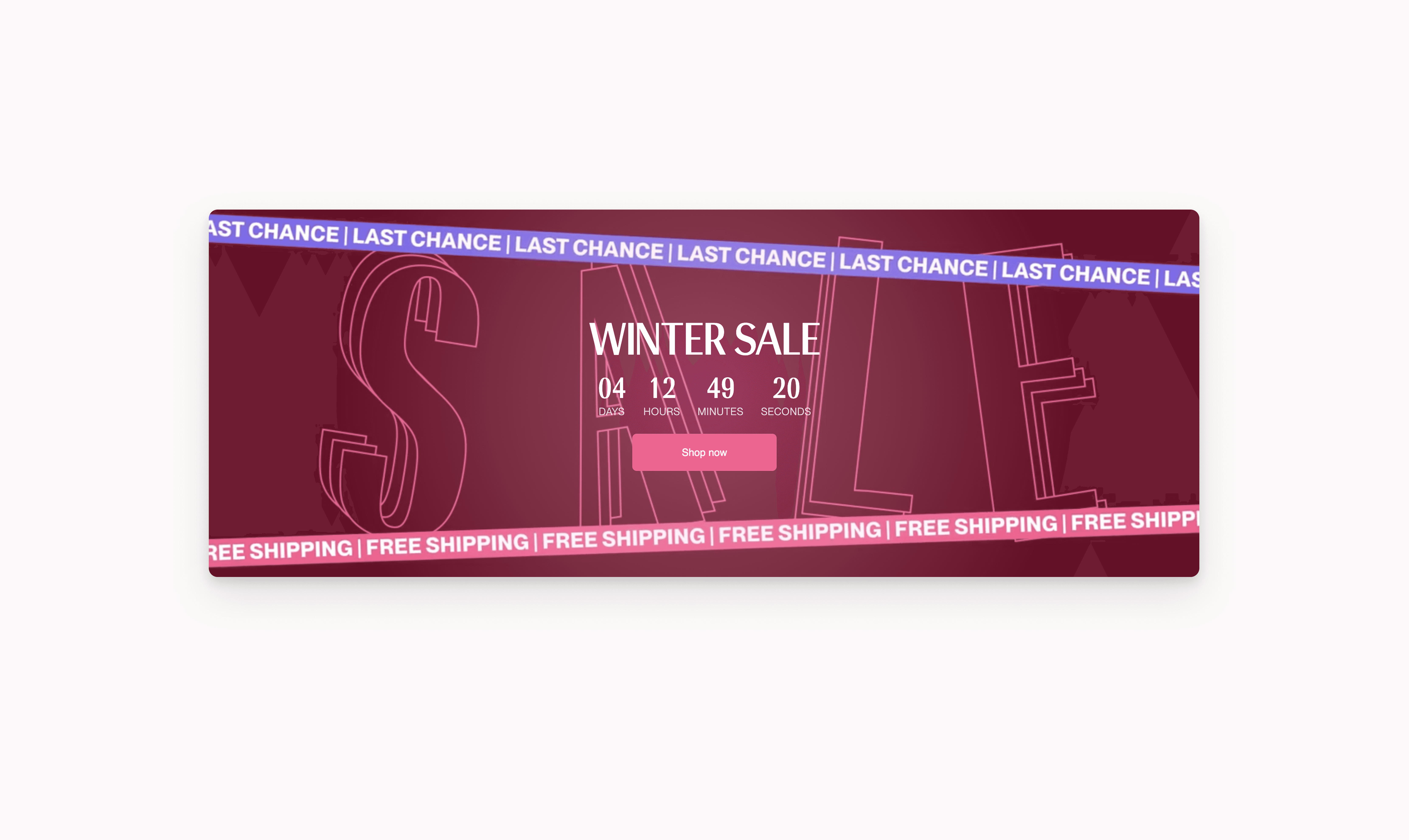
Countdown banner
Objective
The e-commerce team was in need of a flexible and engainig way to communicate running campaigns throughout the browsing experience. So far urgency was primarily delivered through static creative, which limited the ability to adapt messaging, create dynamic experiences, and maintain visibility as customers moved through the storefront.
Solution
As a solution, I designed and built a reusable countdown component that could support different campaign requirements, including static image and video backgrounds, live countdown functionality, and flexible promotional messaging. This created a more effective way to communicate campaign deadlines at key moments in the customer journey, helping to reinforce urgency, encourage purchase decisions, and maximise the impact of time-sensitive promotions.
Outcome
Built within a day, the component was quickly integrated into the wider campaign toolkit, creating a foundation for future promotional experiences that rely on timely, contextual messaging.